Translate Brand Identity Into Streetwear: Color, Logos, Silhouette, Materials
Learn a practical system for branded streetwear for brands using color, logo placement, silhouettes, and materials, with clear do and don’t examples.

Translate brand guidelines into product through four decisions: a colour system that uses brand colour in focused hits rather than head to toe, logo placement across hero, co-star and whisper tiers, silhouettes that match the brand's attitude, and materials chosen for the climate the piece will live in.
- Do the brand work before the design work. Position, tone, audience and how those people actually dress day to day.
- Build the palette in three parts: brand colours as anchors, neutrals that make pieces easy to style, and one or two seasonal accents.
- Use brand colour in focused hits, hood drawcords, interior neck tape, small embroidery, an under-brim, rather than across the whole garment.
- Think in three logo tiers. Hero front and centre, co-star scaled down or off-centre, whisper on interior labels, zipper pulls and hardware.
- Silhouette carries brand attitude more than the logo does. The same mark reads differently on a trim hoodie and a boxy oversized one.
Turn Brand Guidelines Into Wearable Brand Equity
Branded streetwear for corporate brands has moved far beyond boxy trade-show T‑shirts. Today, what your team and partners wear is read almost as quickly as your homepage. The right hoodie, cap, or tote can communicate more about your identity and standards than a 50-slide brand deck.
Streetwear is effective because it circulates through the real environments where business happens: client meetings, airports, coffee runs, and retail floors. When design is intentional, every fit, fabric, and stitch turns brand values into pieces people actively choose to wear, not just accept as a free giveaway.
This guide outlines a simple, repeatable framework for building apparel, uniforms, headwear, and elevated packaging for brands. It walks through how to move from abstract brand language to clear decisions about color, logo placement, silhouette, and materials, with a focus on spring and summer activations.
Decode Your Brand DNA Before You Start Design
Before anyone opens a color picker or design file, the brand work is already in place. The task is to translate the right elements into product.
From the current foundation, extract:
- Mission and purpose
- Tone of voice and writing style
- Visual system, including logo, typography, and color palette
- Audience personas and how they dress in daily life
- Seasonal campaign themes from March through September
Next, translate those pieces into style sliders. Determine where the brand naturally sits on each spectrum:
- Minimal or maximal
- Bold or understated
- Heritage or futuristic
- Premium or playful
For example, a brand that speaks in calm, direct language and leans on soft neutrals will usually sit closer to minimal, understated, and premium. That positioning should guide every design decision.
Do/don’t examples:
- Do: Take a "precision and calm confidence" position and express it through clean silhouettes, controlled color blocking, and subtle logo treatments. Think precise fits, consistent color lines, and micro branding that feels deliberate.
- Don’t: Apply loud, graphic-heavy hoodies to a brand known for quiet luxury and refined simplicity. Oversized prints, neon gradients, and stacked slogans will compete with the story instead of supporting it.
In our work in the Toronto area, skipping this step is a common reason merch feels disconnected from the master brand instead of functioning as a natural extension of it.
Build a Color System That Wears Well in Real Life
Brand colors are powerful, but head‑to‑toe logo color can easily feel costume‑like. The goal is real‑world wearability with instant brand recognition.
Establish a simple color hierarchy:
- Primary brand colors as anchors
- Secondary and neutral tones (black, white, grays, earth tones, navy) to make pieces easy to style
- One or two seasonal accent colors for spring and summer assortments
The primary color should appear on every piece, but not always as the main body color. Treat it as a refined accent rather than the entire canvas.
Color can also indicate roles and tiers without breaking the system. For example:
- Employees in one base color family
- VIP clients with a slightly elevated palette or finish
- A retail collaboration or partner pieces with shared accent colors
The key is to keep the core brand color present, even in small applications, so recognition remains strong.
Do/don’t examples:
- Do: Use the core brand color in focused hits, such as hood drawcords, interior neck tape, small embroidery, or under‑brim details on caps. This keeps each piece easy to integrate into everyday wardrobes while remaining clearly branded.
- Don’t: Cover the full body of a heavy fleece hoodie in a high‑saturation brand color when the audience prefers subtle, elevated office‑to‑street looks. That approach can feel visually loud, uncomfortable in warmer weather, and difficult to style.
For spring and summer, softer base tones and midweight fabrics help the palette feel refined, current, and comfortable across varying temperatures.
Logo Placement That Signals Luxury, Not Giveaways
Logo size and placement may be the biggest distinction between "corporate swag" and "pieces people would purchase." A useful framework for branded streetwear includes three visibility tiers:
- Hero logo: Front and center, clearly visible, usually larger
- Co‑star logo: Off‑center or scaled down, such as a small chest hit or sleeve detail
- Whisper logo: Hidden or micro, such as interior labels, zipper pulls, or tonal debossing
Use hero logos when strong visibility is required, such as a launch event or staff uniform at a busy conference. Co‑star and whisper logos work best for long‑term wear, executive gifts, and VIP pieces.
Consider a range of placement options:
- Left chest embroidery or print
- Sleeve hits near the cuff
- Small marks near the hem or back yoke
- Interior neck prints, woven labels, or custom taping
- Hardware touches, such as branded snaps or zipper pulls
- Packaging details, including printed tissue or foil‑stamped boxes
Visible branding feels premium when it is clean, well‑spaced, and not over‑repeated on the same garment. Discoverable branding, details that reveal themselves over time, often carries the strongest luxury signal.
Do/don’t examples:
- Do: Use a small embroidered logo on the left chest and a tonal debossed mark on a woven label. This reads as modern, confident, and considered.
- Don’t: Stack multiple full‑color logos on the front, back, and sleeve of the same garment unless the brand intentionally operates in a maximalist streetwear space and the audience expects that expression.
Choose Silhouettes and Materials That Match the Brand Story
Silhouette is where brand attitude becomes immediately visible. The same logo reads very differently on a sharp, clean hoodie than on a boxy oversized one.
Align brand positioning with silhouettes:
- Professional, design‑led brands: Tailored streetwear fits, clean lines, and slightly trimmer cuts
- Youth‑driven, culture‑forward brands: Relaxed or oversized fits, dropped shoulders, and bolder proportions
- Inclusive, future‑facing brands: Gender‑inclusive fits, considered length and ease, and size runs that feel genuinely welcoming
Material choices should align with both brand identity and real use cases:
- Heavyweight fleece for premium capsules and cooler climates
- Midweight fleece or brushed cotton for spring and summer events
- Technical blends for travel, activations, or teams that are consistently on the move
- Organic or recycled fabrics for sustainability‑driven narratives
Do/don’t examples:
- Do: Specify midweight, brushed cotton hoodies and structured caps that feel premium yet comfortable for spring and summer conferences, outdoor events, and travel. Pair with breathable tees that maintain their shape.
- Don’t: Default to the lowest‑cost T‑shirt body and thin fleece. Flimsy fabric, twisting seams, and poor drape communicate "disposable freebie," not intentional design.
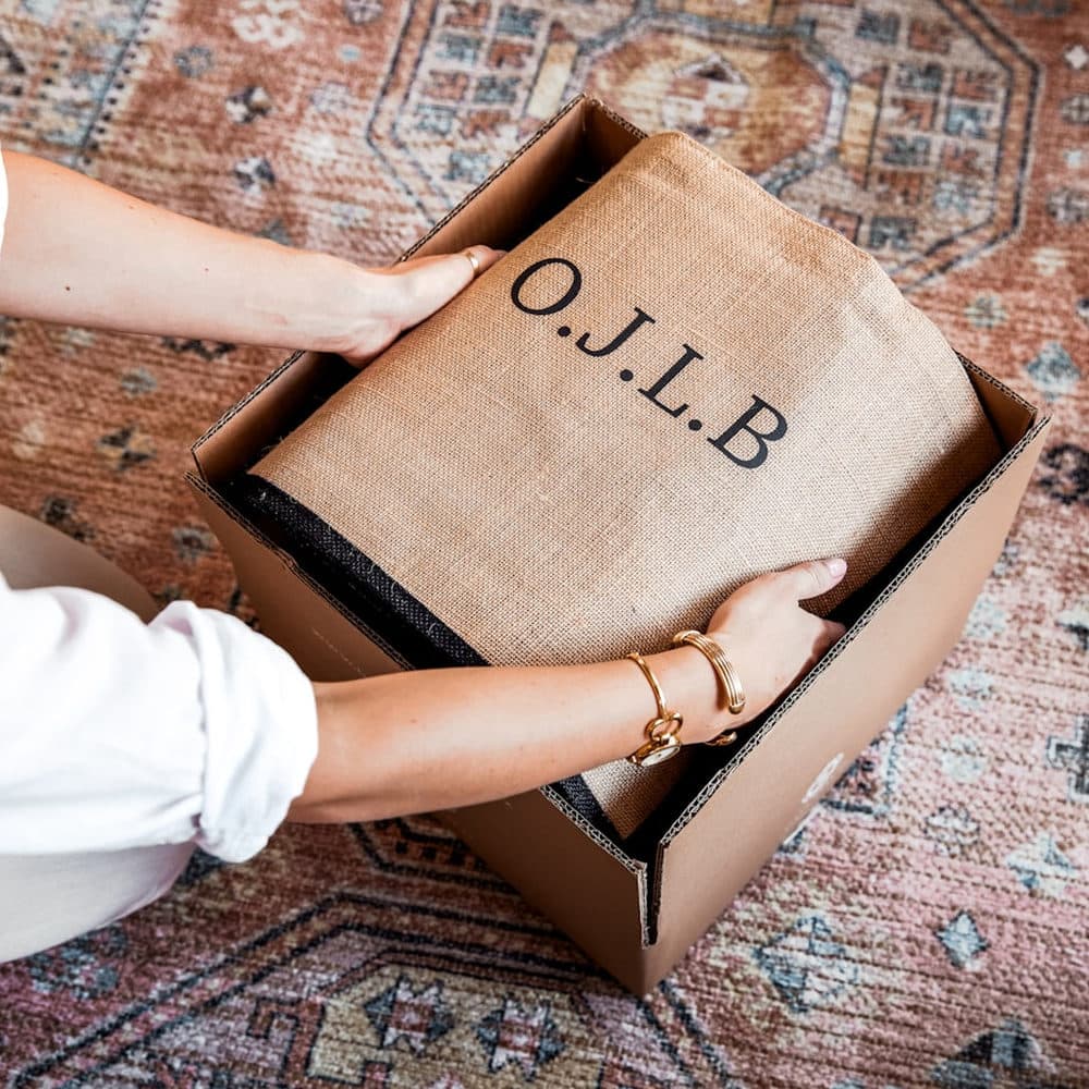
Materials should also connect with the packaging story. A structured, substantial hoodie presented in a custom box with coordinated tissue and labeling delivers one coherent, elevated brand narrative.
Turnkey Streetwear Systems for Scalable Brand Impact
Once there is a clear map from brand DNA to design choices, the next step is to make the system repeatable. Instead of treating each collection as a one‑off, build a modular, scalable program.
Begin with a core capsule:
- Hoodie or crewneck
- Tee
- Cap or beanie
- Tote or small carry piece
For each item, define standards for color, silhouettes, logo placement, and materials. This becomes the brand’s streetwear playbook. Seasonal or campaign capsules then plug into that framework instead of reinventing it, keeping the brand cohesive as it appears in more contexts.
A design‑led manufacturing partner can carry this framework through every stage: creative direction, sampling, fit and fabric selection, embellishment methods, and luxury packaging aligned with the apparel experience. At DMerchandising Inc., this approach supports brands in translating identity into apparel, uniforms, headwear, and packaging that feel like a natural, elevated extension of who they are.
When branded streetwear is built on a clear, repeatable system, every hoodie at a conference, every cap in a retail collaboration, and every tote delivered to a VIP client aligns. The result is simple: the brand presents as organized, intentional, and contemporary, consistently, in motion, in real environments, wherever its people go.
Get Started With Your Project Today
Partner with DMerchandising Inc. to turn your ideas into retail-ready collections that your audience will actually want to wear. Explore our branded streetwear for brands to see how we streamline design, production, and delivery under one roof. We work closely with you to match your vision, budget, and launch timelines so you can move from concept to shelf with confidence. Reach out today so we can help you plan your next streetwear drop from start to finish.
Frequently asked questions
How much brand colour should branded apparel use?
Enough to be recognisable, not enough to look like a uniform. Anchor with brand colours, build around neutrals that make the piece easy to style, and place the strongest colour in focused details such as drawcords, neck tape or an under-brim.
Where should a logo go on branded streetwear?
Across three tiers rather than one. A hero placement front and centre when the mark is the point, a co-star at small chest or sleeve scale, and a whisper on interior labels, zipper pulls or hardware for pieces meant for real wardrobes.
How does silhouette affect how a brand reads?
Considerably. A trim, clean cut reads as professional and design-led; a relaxed or oversized fit with dropped shoulders reads as culture-forward. The same logo on each communicates two different companies.
What materials suit branded apparel?
Match the weight to the climate and the use. Heavyweight fleece for premium capsules and cold weather, midweight brushed cotton for spring and summer events, technical blends for teams that travel constantly.